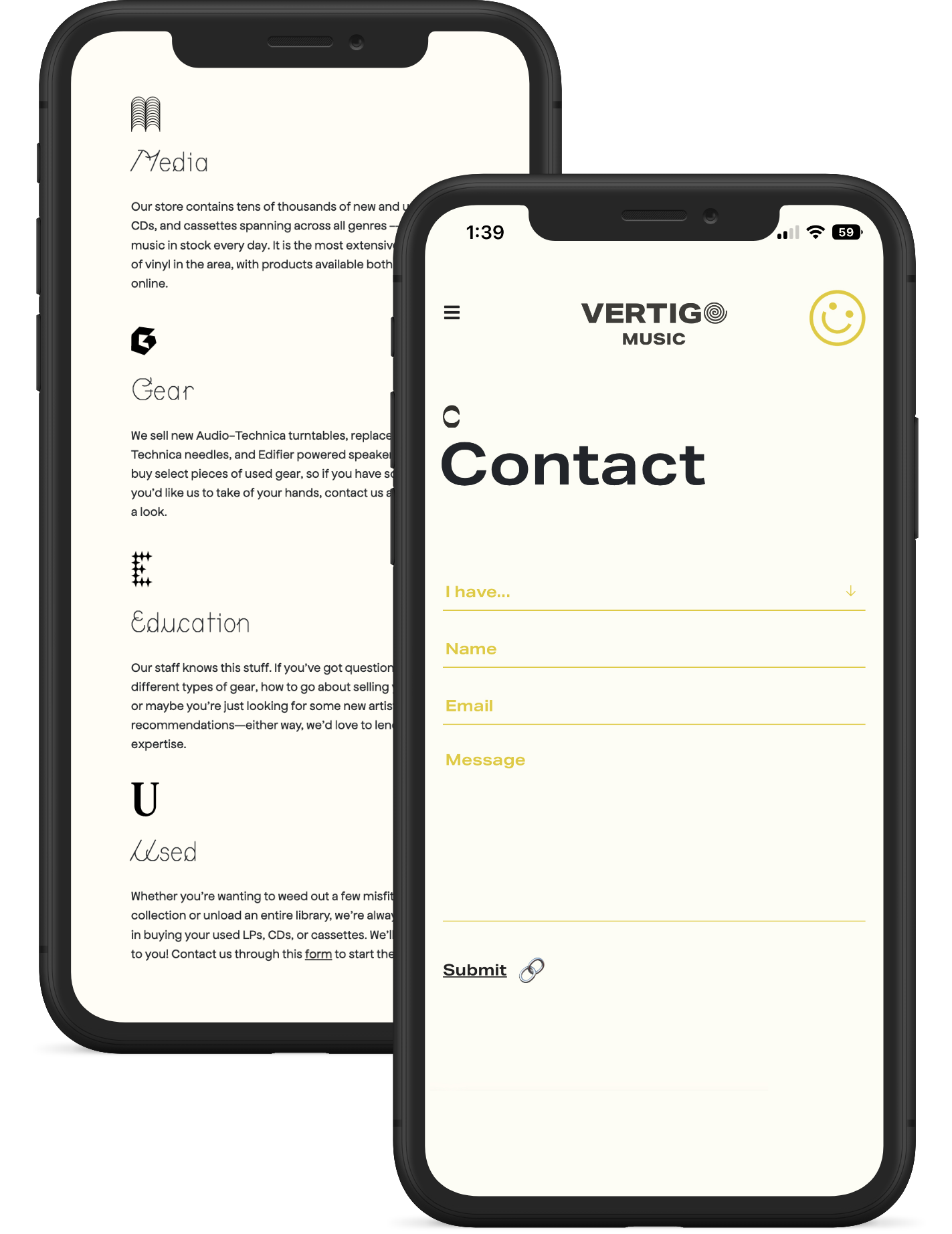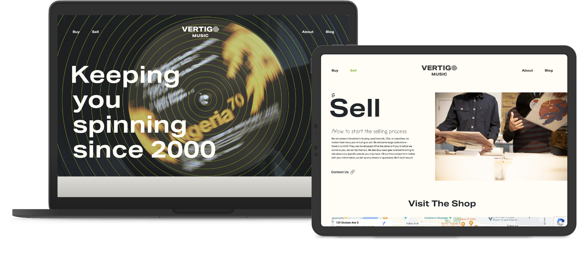
Grand Rapids audiophile favorite Vertigo Records was in sore need of an updated website in 2020. After meeting with the owner and staff our designer devised a new layout that not only made it easier to announce new record releases, but also told the story of the Grand Rapids staple. Our photographer took both exterior and interior shots of the record shop, including some crate digging customers that ended up on the new website.
Services
- Web Design
- Web Development
- Photography
- Design & Branding
Deliverables
- Custom Design
- Custom WordPress
- Website Photos
- Logo Refresh

Unique Details
One of the most exciting aspects of working on the Vertigo Music site was the opportunity to execute the small design flourishes a little differently. Instead of opting for the more corporate-safe graphics, we were able to take a new kind of audience into consideration and get a little more unique with our selections. Using letterforms from abstract fonts, popular emojis and classic smiley faces across the site gave it a fresh feeling that appeals to both new and experienced record collectors alike.
"Music is the tool to express life - and all that makes a difference."
-Herbie Hancock

Meet Herm
Herm Baker has been doing this for a while. Before Vertigo Music opened in 2000, Herm had another shop called Vinyl Solution (started in 1986) which also focused on independent music that couldn’t otherwise be found in the area. Vinyl Solution closed its doors in 1999, but out of the ashes—only a year and a half later—came Vertigo Music on South Division downtown. Since then, Vertigo has become a staple in Grand Rapids’ independent music identity. We were honored to create a fun online experience for such a local legend! Read more about Vertigo and visit their site to see our work here.
High Fidelity Photos
Mindutopia's own photographer, Rudy Malmquist, was hired to take new pictures for the website as well. After confirming the design tone of the website, we had a few internal brainstorming meetings where we created moodboards, shot lists, and general directives for our upcoming shoot with Vertigo. We booked just one day of shooting and went into the shop early before business hours to get some good shots of the place and the team members. The photos that came from that one day ended up making the website. The design and user flows may be strong, but good photography can make or break all of that in a second. In this case, it made the site just that much more inviting, exciting, and high quality.
have a job for us?
Tell us more about your project and how we can help bring your ideas to life!