VINCO

Web Design Web Development

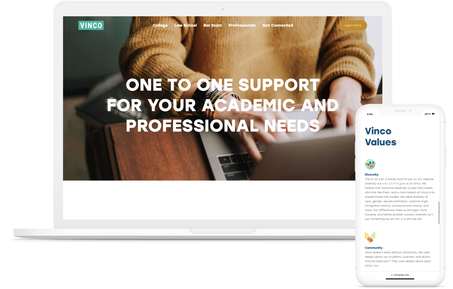
VINCO provides one to one support to help you with your academic and professional goals. As a people-oriented company, VINCO needed an intuitive website that caters to the user with the same one to one attention VINCO is known for. Working with multiple user stories, Mindutopia built a website that brings the VINCO mission to life through meticulous organization and a simple, straightforward design. 

Services

  • Design & Branding
  • Web Design
  • Web Development

Deliverables

  • Branding refresh & logo variants
  • Custom site design
  • Custom WordPress site
Vinco Laptop + Phone

"The time is now to take your next step towards success."

- VINCO
Vinco Desktop

A [project] of many colors

Kerriann Stout, CEO of VINCO Prep, came to us with several goals: To revamp existing branding, create a new website, and design custom business cards. Amongst these major objectives were more specific objectives: To maintain the main brand blue while adding complementary palette options to expand the business identity, to create a variety of business cards with multiple back and front designs, and to create a unique website experience for each of four main personas: College students, law school students, individuals specifically prepping for the Bar Exam, and law professionals.

An expanded brand

The VINCO branding refresh started with the brand blue logo, and rebuilt it in Illustrator to ensure vector-based quality to expand the logo work into various colors and file exports. The palette was expanded into a complementary gold, light blue, navy blue, and off-black. These colors were to represent the major branches of VINCO resource and prep offerings: College, Law School, Bar Exam, and Professionals. The logo variants were exported, and the new palette applied to the website as well as the variety of business card designs.

A website for many, and a cohesive whole

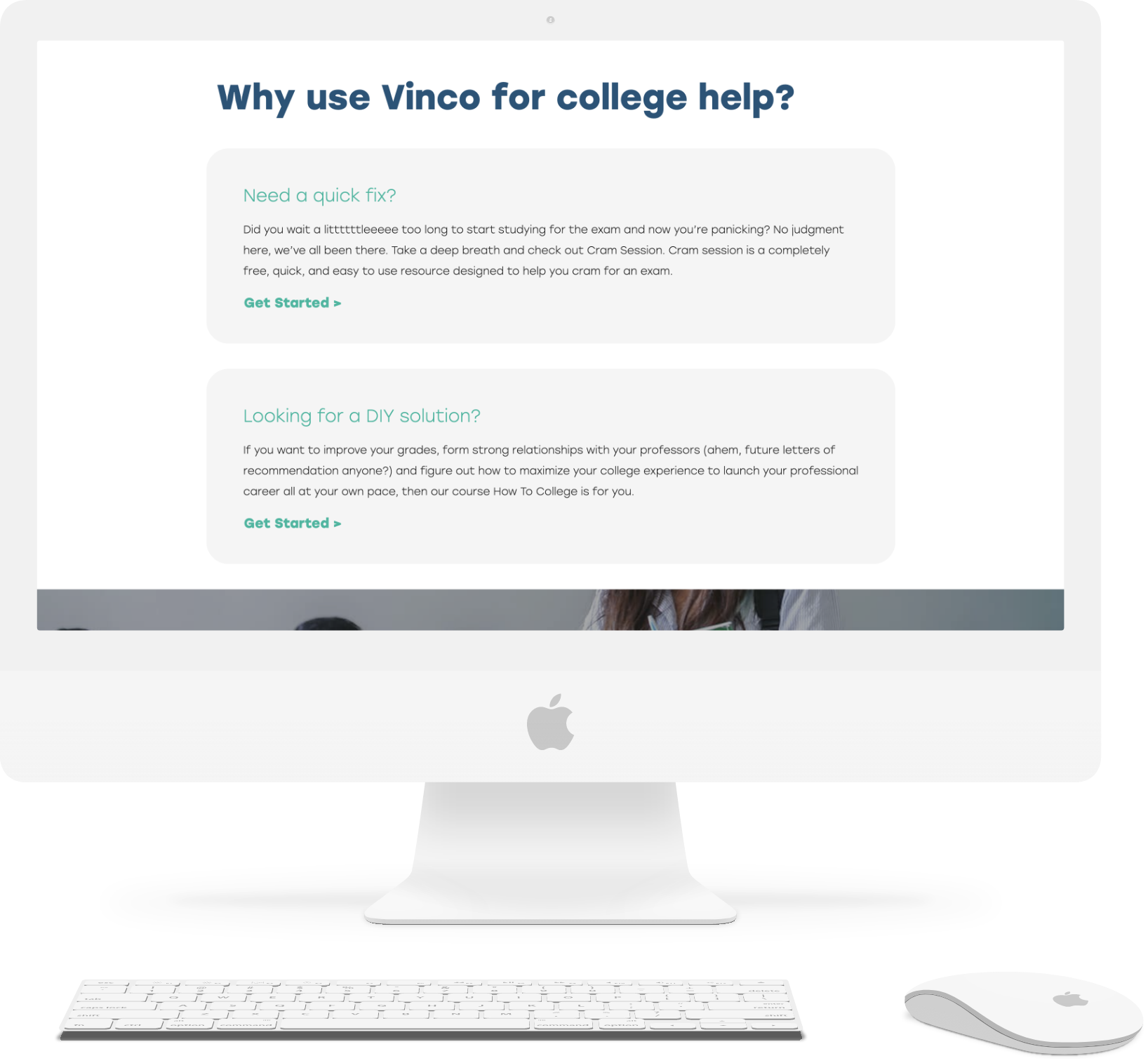
The VINCO prep website was unique in that each major section needed a separate navigation to continue to funnel the user into specific resources as well as the CTA form to schedule a consultation. The homepage served as a landing page for entire organization with the main navigation of high-level branches of populations served. The refreshed logo variants and color palette were applied each website section based on the respective user group. After clicking into each section, a new and specific navigation presented itself. The blog brought all the user groups together, with the variety of colors present, uniting everyone in a space to drive home the cohesive brand identity, and to present resources in a well-organized manner with a few levels of filtering at work.

have a job for us?

Tell us more about your project and how we can help bring your ideas to life!